
 The Afghan War Diary, made available by the Wikileaks group, is the disclosure of internal US Military logs. Wikileaks has been known to release data that contains latitudinal and longitudinal information useful for spatial analysis. I’ve taken the liberty to map the some-76,000 military logs.
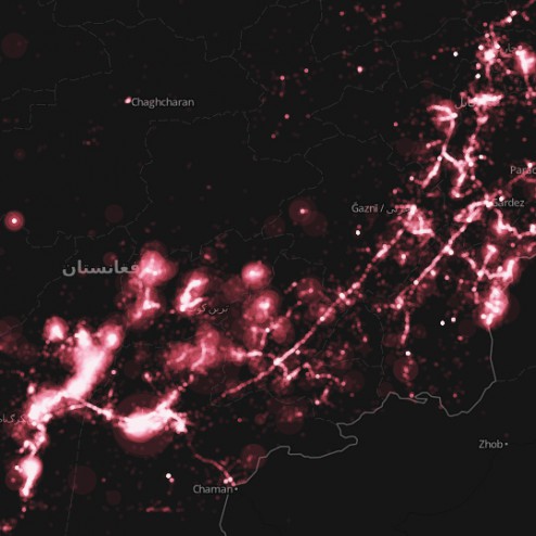
The military logs are a collection of top secret classified correspondences that detail various military encounters and situational reports. Some of the most popular headings in the log are: enemies killed/wounded in action, friendlies killed/wounded in action and reporting unit (squad/other).
Enemies killed in action
To map the Afghan War Diary, I first downloaded the raw data from Wikileaks, and cleaned up the headings so that they would be in the proper format for a spatial database. You can view and download the clean data here by choosing the “Download This Data” button in the upper right-hand corner. You will notice that the data is hosted on CartoDB, which is how I have created the map below! Essentially, CartoDB provides a hosting solution for geographic data, as well as the ability to stylize the thematic content using carto (css) for maps!
This map displays the amount of enemies killed in action per report/correspondence by the military. I’ve used graduated symbols to proportionally represent the amount of enemies killed (larger symbols = more deaths). Further, opacity and layer blending was used to achieve the bright hot-spot effect, which highlights areas where multiple reports have been submitted. See the carto (css) markup code below for a better indication of how the map was created (or if you want to replicate the effect yourself!).
/** bubble visualization */
#afghan_war_diary_ekia{
  marker-fill: #FF5F6F;
  marker-line-color: #FFF;
  marker-line-width: .1;
  marker-line-opacity: 1;
  marker-opacity: 0.1;
  marker-comp-op: screen;
  marker-placement: point;
  marker-type: ellipse;
  marker-allow-overlap: true;
  marker-clip: false;
  marker-multi-policy: largest;
}
#afghan_war_diary_ekia [ enemy_kia <= 181] {
   marker-width: 64.0;
}
#afghan_war_diary_ekia [ enemy_kia <= 95] {
   marker-width: 32.4;
}
#afghan_war_diary_ekia [ enemy_kia <= 50] {
   marker-width: 28.8;
}
#afghan_war_diary_ekia [ enemy_kia <= 26] {
   marker-width: 25.4;
}
#afghan_war_diary_ekia [ enemy_kia <= 14] {
   marker-width: 21.8;
}
#afghan_war_diary_ekia [ enemy_kia <= 8] {
   marker-width: 18.2;
}
#afghan_war_diary_ekia [ enemy_kia <= 5] {
   marker-width: 14.6;
}
#afghan_war_diary_ekia [ enemy_kia <= 3] {
   marker-width: 11.2;
}
#afghan_war_diary_ekia [ enemy_kia <= 2] {
   marker-width: 7.6;
}
#afghan_war_diary_ekia [ enemy_kia <= 1] {
   marker-width: 3.0;
}
If this post helped you and you enjoy my site I would happily accept Litecoin donations:
LKPfT772e9HxvXYcA8LVDctTmENoqQxQF3
Hi Michael, just seen your amazing global flight paths mapping images on the BBC website. Do you have plans to make them available to the public? I’d love to get some prints — they’re incredible images!
Hi Michael , flight paths, great images. Are they available to use, please contact
check CartoDB record 4921 / its showing data in the Gulf of Guinea off of West Africa.
[…] Spatial Analysis – Mapping the Afghan War Diary […]