
Welcome to Tips.gg, your go-to website for all things sports analytics! Whether you're a die-hard fan, a bettor looking for an edge, or just someone curious about the numbers behind the game, we've got you covered. Our team of expert analysts and data scientists work tirelessly to provide you with the most accurate and insightful information.
Feb 282023
Jan 182014
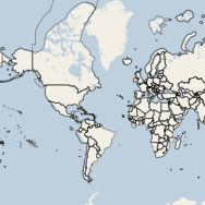
 TileStream is an open source tile server developed by MapBox, which borrows extensively from their commercial MapBox tile server product. TileStream loads map layer packages created in the TileMill application, which are stored on the server as SQLite databases in the mbtiles specification/schema. On the other hand, Heroku is a cloud application platform that supports Python, Ruby, Java and Node.js apps, the latter of which TileStream is dependent upon. This post will show how to deploy a TileStream server on the Heroku cloud application platform, thereby allowing you to serve your map tiles using scalable infrastructure that can respond to fluctuations in the demand of your web maps. See the result here.
Nov 232013
 Life as a grad student, as many of you already know, is a constant battle with completing assignments on time, keeping up the grades for future funding opportunities and getting enough sleep. My first semester in the Master of Spatial Analysis program is nearing its end in what seems like the shortest semester of school I’ve ever taken. During this time I have had the pleasure to strengthen some of my skills in the R language for statistical computing for the purpose of water quality trend analysis (SA8904 — GIS Project Management). This post will show how I have used R for water quality trend analysis, using publicaly available data from the USGS (due to a NDA that prohibits me to share my school work).
Nov 012013
 Hi everyone!
For the past 6 months I have been working hard to get you a limited edition print of the global flights. I am very excited to release this print in a run of 50, signed and numbered.
Find out more details and buy yours today: http://shop.www.spatialanalysis.ca
May 302013
 Statistically speaking, the Global Flight Paths images are my most recognized and shared pieces of work and even more so since they went viral and media crazy over the past week. The BBC News reported over 1 million UK-based visitors had read the story on their website and over 15,000 social shares were recorded. The BBC News also tweeted this story to over 1.5 million twitter followers, which in turn retweeted the link to their many millions of followers. If anyone has a way to aggregate and quantify these tweet+retweet statistics I would be more than happy to explore.
I am currently waiting on licensing and prints information from the powers above me so please, if you are interested in using the images or wanting prints, kindly send me an email stating so! Thank you and I will try my best to get back to everyone as quick as possible.
Some other interesting stats:
- My failed ESRI MapBook submission has over 46,000 views through imgur in 3 days (Thanks reddit!)
- I received more traffic on this blog in the past week than I had in the first year running this site, with over 5,000 unique visitors in 2 days due to a combination of the BBC, reddit and slashdot.
Jan 242013
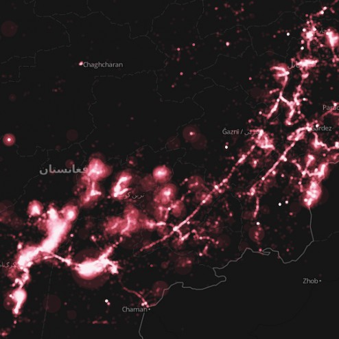 The Afghan War Diary, made available by the Wikileaks group, is the disclosure of internal US Military logs. Wikileaks has been known to release data that contains latitudinal and longitudinal information useful for spatial analysis. I’ve taken the liberty to map the some-76,000 military logs.
The military logs are a collection of top secret classified correspondences that detail various military encounters and situational reports. Some of the most popular headings in the log are: enemies killed/wounded in action, friendlies killed/wounded in action and reporting unit (squad/other).
Nov 202012
 It has been a while since I posted on this website; but you may have noticed that I have been fairly busy elsewhere, such as on LinkedIn or Twitter.
This post will stand as a reminder to myself that we can’t always foresee the bumps along the road. I am speaking about the ESRI mapbook submission that was due on November 16, which I missed because of undue difficulties in obtaining and manipulating trivial data. Why do I say trivial? Given the way my submission looks at the moment, I would say it is acceptable, if not near perfect for the mapbook categories of transportation and cartography.
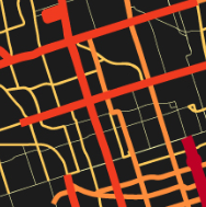 As the City of Toronto inches closer and closer towards the green light for new Metrolinx projects like the LRT lines for Sheppard East and Eglinton Crosstown, GIS will play an ever crucial role in assisting decision makers by framing City-wide issues into a perspective that can be quickly comprehended. Mapping service density aims to identify transit deserts in the overall transit network. These maps emphasize the difference in the levels of service (number of trips) by using darker/stronger colours and thicker lines for higher than average trips, and vice-versa for routes that display below the average number of trips.
Apr 262012
 Let’s face it, GIS is a term loosely (if even that) understood by the public. Without a university degree in Geography or certificate in GIS, web-mapping enables users to explore geospatial data, patterns and phenomenon quite effectively. As an exploratory tool, web-mapping bridges the gap between the analytical engine that is the GIS software, and the basic static map.
Mar 212012
 The OpenStreetMap project has over half a million map contributors and a fairly extensive developer community. This past weekend, the first-ever OpenStreetMap hack weekend was held in Toronto, Canada (second-ever North American hack) at Ryerson University. This event was jointly hosted with the Department of Geography, Master of Spatial Analysis and the Student Association of Geographic Analysis. Event coördination was taken care of by Richard Weait, long-time advocate of OpenStreetMap.
Mar 102012
 Late last year, Google announced that their Maps API and Google Maps Imagery would become a charged service for high volume users. Anyone hosting more than 25,000 daily map views would incur charges according to this pricing scheme. It is important to note that, not only is the API restricted, but the imagery (google maps layers) is restricted in the same fashion. For those that use any other API but still call upon Google base layers, the restriction of 25,000 daily map views still holds true. Now, this website certainly won’t generate that kind of traffic anytime in the near future, but there certainly are those kinds of websites on the internet that have well over a million page views a day. Those that first come to mind are travel service providers and real-estate agencies. Both services use maps as spatial decision support tools (eg. where should I live? where should we visit?). I am taking this opportunity to round up the APIs that I am familiar with and would recommend to those making the move away from Google.